Test a Notification
1. Page Objective
The Test a Notification page allows the user (or the support / QA team) to generate a test notification in order to:
- verify the proper functioning of local notifications
- check the display, content, and behavior of notifications
- test different notification types and priority levels
This page is mainly intended for testing and validation purposes.
2. Access Context
This page is accessible from:
- the Notifications page
- the context menu (⋮)
- the Test a notification option
It is displayed as a modal window on top of the Notifications page.
3. General Page Structure
3.1 Display Type
- Centered modal window
- Darkened background (overlay)
- Blocking interaction until the modal is closed
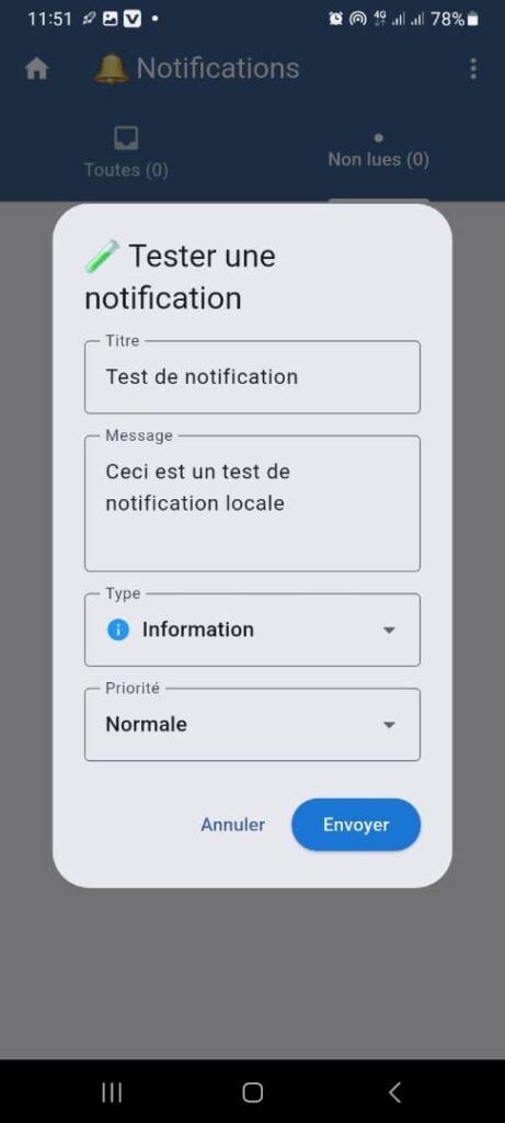
4. Modal Header
4.1 Icon
- Icon: pencil / test
- Indicates a creation or simulation action
4.2 Title
Test a Notification
🎯 Immediately clarifies the purpose of the window.
5. Notification Test Form
5.1 Title Field
- Type: text field
- Label: Title
- Default value: Test notification
- Function:
Defines the main title of the notification - Required: ✅ Yes
5.2 Message Field
- Type: text area
- Label: Message
- Default value:
This is a local notification test - Function:
Defines the detailed content of the notification - Required: ✅ Yes
5.3 Type Field
- Type: dropdown list
- Selected value: Information
- Examples of possible values:
- Information
- Alert
- Success
- Error
- Function:
Determines the icon and visual style of the notification
5.4 Priority Field
- Type: dropdown list
- Selected value: Normal
- Examples of possible values:
- Low
- Normal
- High
- Critical
- Function:
Influences system behavior (display order, sound, vibration)
6. Action Buttons
6.1 Cancel Button
- Function:
- closes the modal window
- cancels any action
- No changes are applied
6.2 Send Button
- Color: blue
- Function:
- immediately generates the test notification
- displays the notification according to the defined settings
- Conditions:
- the Title and Message fields must be filled in
7. Expected Functional Behaviors
✅ Immediate display of the notification after sending
✅ Respect of user notification settings (sound, vibration)
✅ No persistence in the real notification history (if configured as a test)
✅ Visual update consistent with the selected type and priority
8. Error Cases to Handle
- Required fields left empty
- Local notifications disabled
- System permissions denied
- Notification display failure
👉 In these cases, a clear error message must be displayed.
9. Security and Best Practices
- Test notifications must not impact real user data
- Tests must not trigger any business logic (payment, transaction, security)
- Feature may be restricted if necessary (admin / support)
10. UX / UI Rules
- Simple and understandable interface
- Default values to facilitate testing
- Quick closure via Cancel
- Clearly differentiated action buttons
11. Summary
✅ Quick notification testing tool
✅ Flexible configuration (content, type, priority)
✅ Useful for support, QA, and maintenance
✅ Improves notification system reliability
